Why accessibility can't be a phase 2
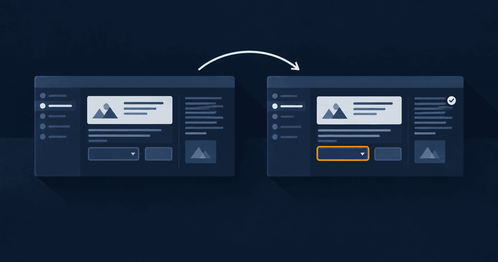
"We'll handle that in phase 2" is the phrase I've heard most often about web accessibility. It makes no technical sense, even though it makes a lot of short-term budget sense.
It makes no technical sense because accessibility isn't a layer you add on top of a finished interface. It's a property of how that interface was built from the very first component. Adding it later isn't adding something: it's redoing what already exists.
Why "later" costs more
A button with insufficient colour contrast doesn't get fixed by slapping a contrast sticker on top. It gets fixed by changing the colour, and that colour is probably hardcoded in fifteen places if there was no design tokens system from the start.
A form with the wrong tab order doesn't get fixed with a JavaScript patch. It gets fixed by reviewing the semantic HTML of every field, which — if written wrong from the beginning — is probably repeated in every form on the site.
The pattern is always the same: an accessibility problem caught late isn't an isolated problem. It's a problem multiplied by every place the same decision got repeated without review.
The three checks I run from design, not from code
Colour contrast, in Figma, before exporting anything. The WCAG AA standard asks for a 4.5:1 contrast ratio for normal text and 3:1 for large text. There are Figma plugins that check this at the moment you pick the colour, not after the developer has already implemented the component. Catching this in design costs changing a hex value. Catching it in production costs finding every place that colour was used.
Focus order, in the navigable prototype. When I build the interactive Figma prototype, I walk it simulating that I only have a keyboard: tab, tab, tab. If the screen's logical order doesn't match the tab order the prototype suggests, that's a warning sign. The layout structure will produce the same problem in code, because tab order in HTML follows document order, not visual order.
Alt text, as part of the content, not as an optional field filled in at the end. When I design an image that communicates information — a status icon, a chart — I write down what it says at that same moment. I don't treat it as an SEO task completed afterwards. If I can't write a short sentence explaining what the image conveys, that's a warning sign: it usually means the image communicates something ambiguous, not just that the text is missing.
A concrete example: visible focus
It's common to see buttons that strip the keyboard focus outline for aesthetic reasons — it looks "cleaner" without that blue browser ring. The problem is that without it, someone navigating by keyboard has no way to know which element they're on.
The fix isn't "never remove it". It's designing your own focus state, with the site's visual identity, that replaces the browser's default instead of deleting it. On this very portfolio, every checkbox in the admin panel has its own focus ring in the site's accent colour. It's visible, but on-brand.
That's a design decision, not a code one. If the design doesn't account for a focus state, the developer has two options: leave the browser's ugly default, or remove it and break accessibility. Neither is the developer's fault. It's a gap the design left behind.
What web accessibility isn't
It isn't a checklist run at the end with an automated tool like axe or Lighthouse. Those tools catch maybe 30% of real problems: contrast, missing attributes, heading structure. They don't catch whether the reading order makes sense, or whether an error message explains what to do. Nor whether an entire flow is usable end to end with a screen reader.
They're a floor, not a guarantee. They catch the obvious, they don't certify the product is genuinely accessible.
The business argument, for whoever needs it
Beyond doing the right thing: a site with better semantic structure and better contrast usually also scores better on SEO. The reason is that many of the signals Google uses to understand a page are the same ones a screen reader needs: heading hierarchy, alt text, document structure. That's not a coincidence. Both systems try to understand the same thing — what each part of the page is, and in what order it matters.
Designing accessibly from the start isn't an extra task that slows the project down. It's the same task you're already doing — defining hierarchy, defining contrast, defining structure — done once instead of twice.
Keep reading
- My UX personas don't have stock photos (and that's why they work)A persona with a made-up name and a stock-photo smile is report decoration. How I build personas that actually change a design decision.
- Building and running a SaaS: what changes once customers are payingThere's a huge difference between building a product and keeping it running on a Tuesday at 3am when a payment webhook fails. What I learned taking GymSmartAccess from idea to a real business.