How I design an interface from scratch: my complete UX/UI process
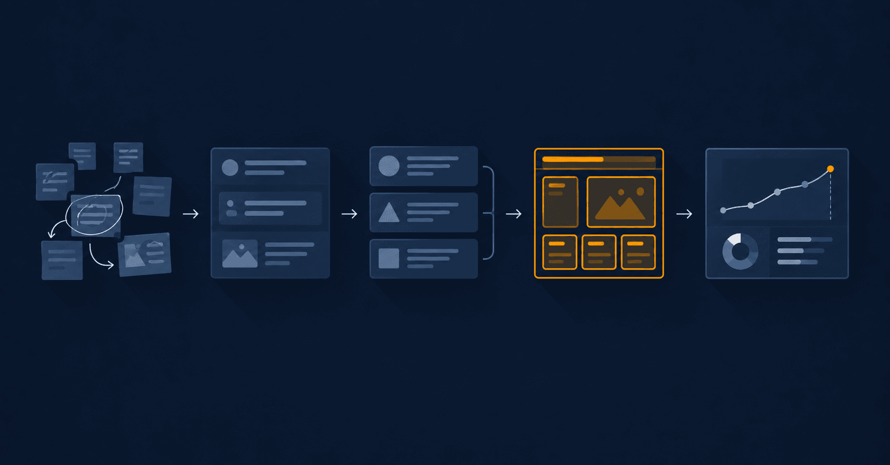
When someone asks me for a new interface, the first reaction is almost always the same: send me the Figma. It makes sense, because in any UX/UI design process the Figma file is the only part you can actually look at. But opening it first is like starting to cook without knowing how many people are coming to dinner.
Opening Figma is step four. Before it there are three stages nobody sees, and they decide whether what you draw is useful or just expensive decoration.
This is the UX/UI design process I follow. I didn't invent it: it sits on top of James Garrett's Five Planes and on research methods that have existed for decades. But it has been sharpened by applying it to real projects. The numbers here come from the redesign I did for Mexx, Argentina's largest tech retailer, 34 years in the market.
Stage 1 of the UX/UI design process: understand first
The first stage produces zero pixels. It produces evidence.
When I started with Mexx, the temptation was obvious: the platform looked dated, so "modernize it". That instinct is exactly the problem. Modernizing is an aesthetic opinion. It doesn't tell you what is costing money.
So I did three things before having a single design idea:
Heuristic audit. I walked the platform against Nielsen's 10 usability heuristics, one by one, documenting every violation with a screenshot. Result: 7 out of 10 failed. That is no longer an opinion, it's an inventory.
A survey with real users. I wrote 12 questions, carefully avoiding leading ones — asking "does it bother you when costs are hidden?" guarantees a yes that means nothing — and 10 people who buy tech online answered.
UX laws analysis. I reviewed which behavioural principles the interface was breaking: Hick, Fitts, Jakob, proximity. I found 6 in direct violation.
Two findings came out of that, and I would never have found them by drawing:
- 80% of users researched on their phone and bought on a desktop. And the cart did not survive the jump, because it lived in
localStorage. People built their cart on the bus and got home to an empty one. - 100% of respondents named unexpected shipping costs as a reason to abandon. At Mexx that included digital products: a Windows license reached checkout with over $250 of physical shipping attached, revealed only at the Mercado Pago step.
Neither problem was visual. Both were costing sales.
Stage 2: define the problem, not the solution
With evidence on the table, stage two is about narrowing. And narrowing mostly means choosing what you are not going to fix.
A full redesign of an e-commerce platform with 34 years of history is a multi-year project. I had four weeks. So the question was not "what's wrong?" — that list was enormous — but "which two things, once fixed, move the needle?".
I picked the two flows the evidence had already pointed at: cart persistence across devices, and cost transparency.
In this stage I also ran tree testing with 10 participants in UXTweak, which is a pure information architecture test: no design, no colour, just the category tree and a task. The result was uncomfortable and extremely valuable: the "Software" category scored only 40% directness. People couldn't find it because they weren't looking for that word. I renamed it to "Digital Licenses" and the problem evaporated.
That change cost two words. I found it because I tested the structure before designing on top of it.
Stage 3: generate ideas, then kill them
This is where ideas finally appear, and plenty of them. The work isn't having them, it's killing them.
I used a Lean UX Canvas to organize hypotheses and an FVD matrix — feasibility, value, difficulty — to score 10 ideas. Six survived:
- Persistent cart synced in the database, not in
localStorage - Floating cost breakdown, visible from the very first step
- Explicit digital-product label
- Express login modal
- Guest checkout
- Cart recovery via magic link
And I discarded 4: WhatsApp cart integration, an AFIP tax calculator, an AI chatbot and gamification. All four sounded great in a meeting. None solved the two problems the evidence had flagged.
Discarding explicitly, and writing down why, is what stops those ideas from returning three months later dressed up as "a new proposal".
Stage 4: now, finally, Figma
The high-fidelity prototype is where most people think the work begins. For me it's where the work becomes visible.
I built both complete flows in Figma, with a real design system behind them: the brand red (#E73E3E), Inter and Merriweather typefaces, a 4-pixel spacing system, reusable atomic components and six documented animations.
The key word there is system. A pretty prototype is a picture. A design system is something a developer can implement without guessing: every colour is a token, every spacing is a multiple, every component has defined states.
Since I also write the code, I charge myself for that difference. A design that can't be implemented is a design I didn't finish.
Stage 5: test, the stage almost nobody does
This is where design that works separates from design that is liked.
I ran a usability test in Maze with 10 participants across the two critical tasks. The results:
Task 1 — cart continuity: 100% success rate, 32 seconds average, 80% directness, 0% drop-off.
Task 2 — cost transparency: 85.7% success, 71 seconds, 40% directness, 14.3% drop-off.
And here is the interesting part: that 14.3% drop-off in task 2 is not a design failure. It's people who saw the cost, evaluated it and decided not to buy. That is exactly what should happen when information is transparent. The alternative — buying without seeing the cost and discovering it at the last step — isn't a conversion, it's an angry refund.
Reading that metric correctly is the difference between understanding the data and using it to justify what you already wanted to do.
The test also flagged something I wasn't looking for: a 49-51% misclick rate in the header. The visual hierarchy up there wasn't resolved. I didn't get to fix it in those four weeks, and I documented it as debt, because a case study that only tells you what went well isn't a case study, it's a brochure.
What this process changed in me as a developer
I came to design from code, not the other way around. And the strongest effect wasn't learning Figma: it was no longer arguing about interfaces with opinions.
Before, a discussion about a button ended with whoever had the most authority in the room. Now it ends with whatever the tree test says. It's a far less exhausting way to work, and it produces better products.
It also changed the order in which I build. When I started GymSmartAccess, my SaaS platform for gyms, I began by understanding why owners were chasing members for payment, not by picking a framework. The stack came out of that, not the reverse.
The honest summary
Five stages: understand, define, ideate, prototype, test. Three of the five happen before Figma opens.
If you're short on time and can only pick one, pick the first. A heuristic audit and ten well-written survey answers give you more direction than two weeks of visual exploration. And if you can pick two, add the last one: testing with ten people tells you in an afternoon what you would otherwise discover in production, with real users and real money on the line.
The complete Mexx case, with screenshots and the navigable prototype, is in my portfolio. And if you're thinking about a project where design and code are considered together from the start, get in touch.
Keep reading
- My UX personas don't have stock photos (and that's why they work)A persona with a made-up name and a stock-photo smile is report decoration. How I build personas that actually change a design decision.
- Building and running a SaaS: what changes once customers are payingThere's a huge difference between building a product and keeping it running on a Tuesday at 3am when a payment webhook fails. What I learned taking GymSmartAccess from idea to a real business.