Tree testing: how I found out an entire category made no sense
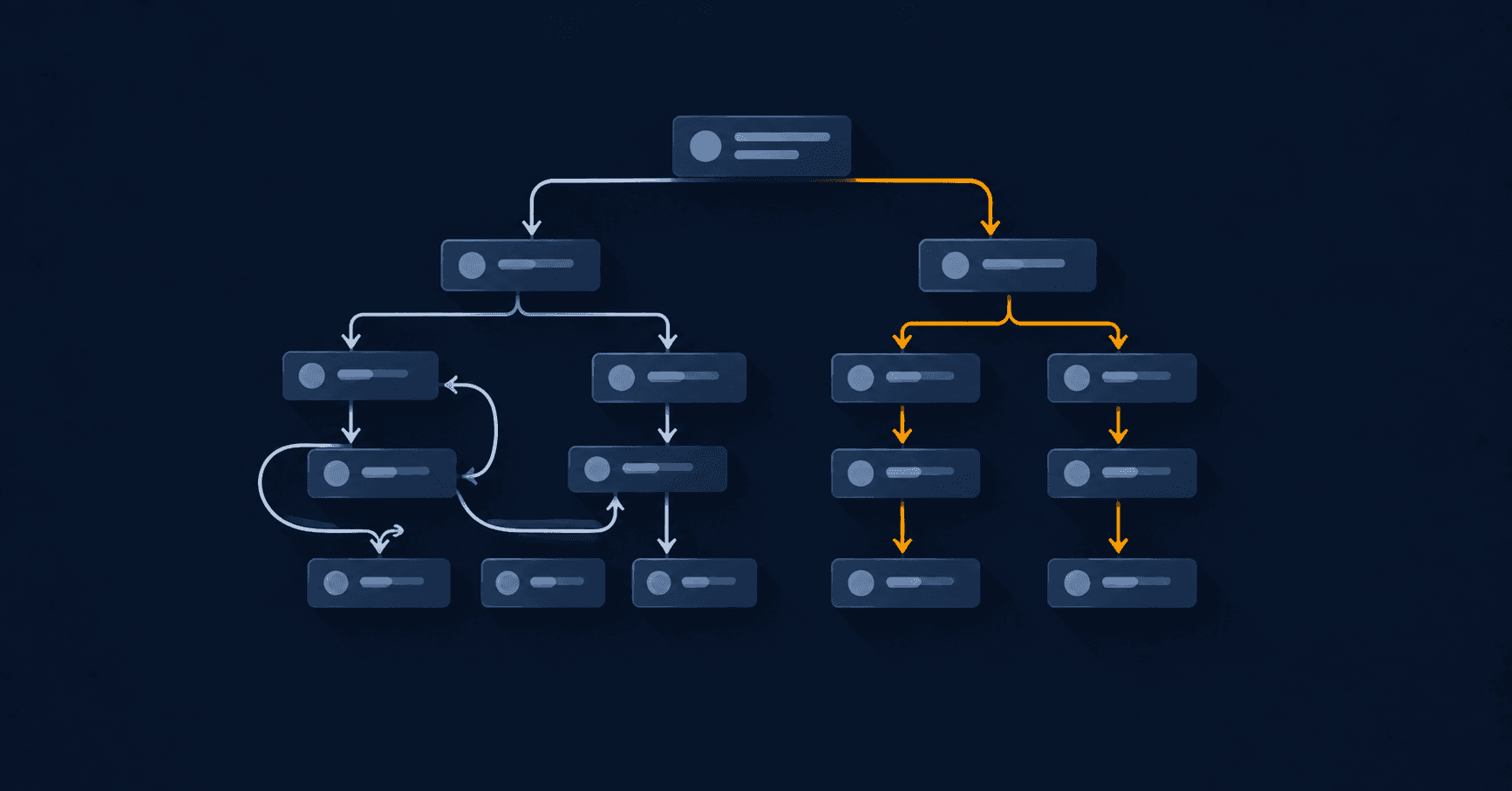
There's a kind of design problem that design can't fix, and tree testing exists to find it: when the issue isn't how the menu looks, but what the things inside it are called.
That problem is expensive because you find it late. You redesign the navigation, it looks great, and people still can't find what they're after. So you blame the visuals, change them again, and it still doesn't work.
Tree testing exists to catch it earlier. And it's one of the cheapest research techniques there is.
What tree testing is
You show someone only the structure — the tree of categories and subcategories, in plain text, no colour, no design, no search box — and ask them to find something. It is the counterpart to card sorting: one proposes the structure, the other puts it to the test.
The "no design" part is what matters. If you show the real interface, you don't know whether they found the product because the structure makes sense or because an orange banner put it in front of them. Strip the visuals away and the only thing under test is whether the names mean what you think they mean.
How I set up a tree testing session
I write tasks, not questions. Not "where would you put licenses?" — that asks for their opinion as an architect — but "you need to buy a Windows 11 license: where do you look?". The task imitates a real intention.
I keep the tree's words out of the task. If the task says "find antivirus software" and there's a category called "Software", you tested nothing: you tested whether they can read. The task has to be written in the user's vocabulary, not the menu's.
Between 5 and 8 tasks. More than that and people get tired, and tiredness shows up in the data looking exactly like confusion.
10 participants is enough. As with most qualitative research, the patterns appear fast.
I used UXTweak. Optimal Workshop is the other standard tool. Both return the same things.
The two numbers that matter
Success rate: how many reached the right destination. It's the obvious number and the least interesting.
Directness: how many got there without wandering, without stepping in and out of other branches. This is the number to watch.
The gap between the two is the whole finding. A task with high success and low directness means: people do eventually find it, but only after looking in two or three wrong places first. In a test that reads as success. In production it reads as abandonment, because in real life nobody has the patience of a study participant who knows they're being watched.
The concrete case
In the tree test I ran for the Mexx redesign, the "Software" category scored 40% directness.
Six out of ten people looking for a Windows license did not go to "Software" first. They went to "Accessories", to "Services", or straight to the search box. The word "Software" came from the company's internal catalogue — a category that made sense to whoever manages inventory, and not to whoever is buying.
I renamed it to "Digital Licenses", which is closer to what people actually have in mind when they want to buy Windows or Office.
That change cost two words. And I found it because I tested the structure before designing on top of it. Had I discovered it after the visual redesign, the fix would have been identical but it would have arrived with two weeks of work already sunk into it.
When it's worth running
Before redesigning a navigation. The obvious moment, and the most profitable one.
When search gets used too much. If a large share of your traffic goes straight to the search box, it isn't that people love searching: it's that they gave up on the menu. Search is covering for an architecture problem.
When support keeps getting the same question. "Where do I find X?", repeated, is a tree test people are already running on you for free — just without the data.
The limit
Tree testing tells you whether the names and the hierarchy work. It tells you nothing about whether the product page converts, whether checkout is clear, or whether the site loads fast. It's a surgically precise tool for one specific problem.
And like all research, it doesn't replace the decision: it informs it. The test told me "Software" wasn't understood. Choosing "Digital Licenses" over "Programs" or "Downloads" is still a design judgement — but now it's a judgement with a floor under it.
This is one of the techniques I use in the definition stage of my design process, after the heuristic audit and before drawing anything.
Keep reading
- How to write survey questions that don't tell you what you want to hearA badly written survey is worse than no survey: it hands you numbers that confirm what you already believed. The most common mistakes and how I avoid them.
- How I design an interface from scratch: my complete UX/UI processThe five stages I work through before calling an interface finished, with real numbers from the redesign I did for Argentina's largest tech retailer.